REDESIGN

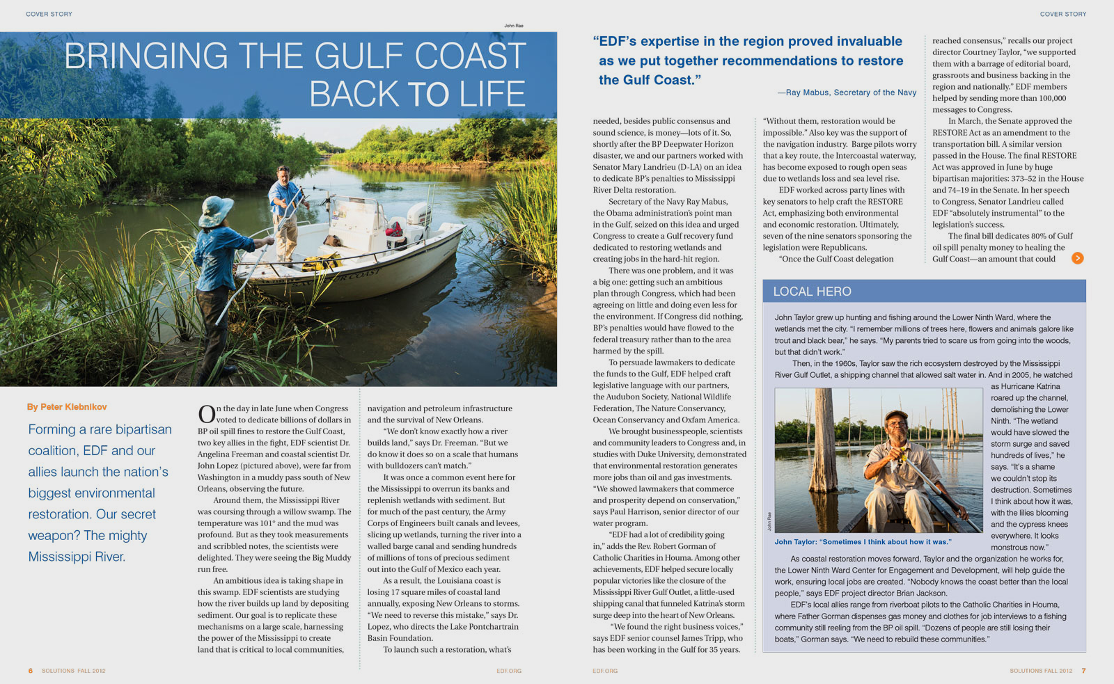
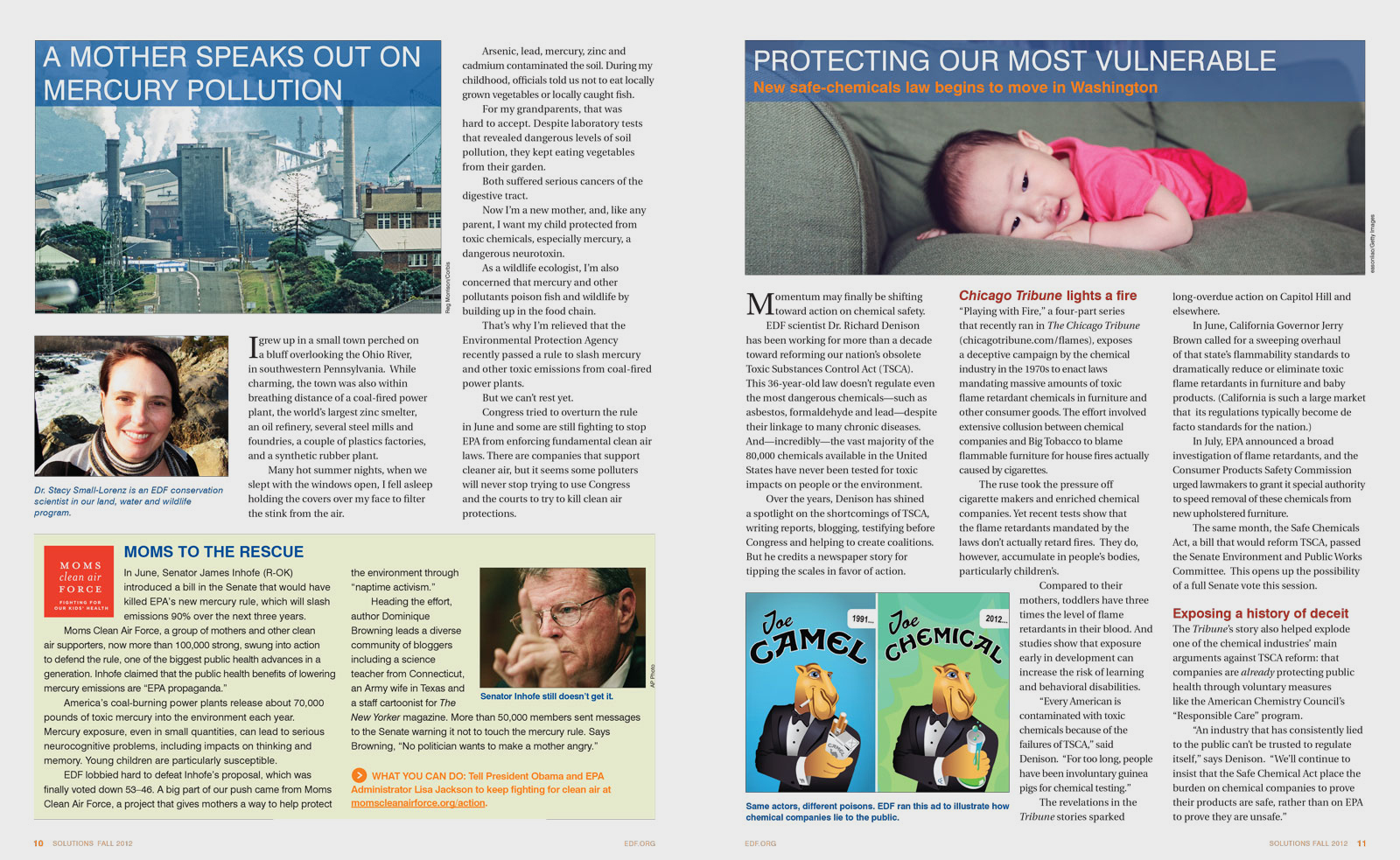
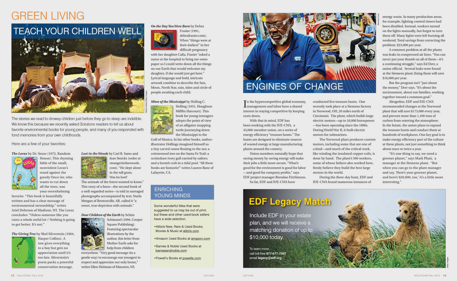
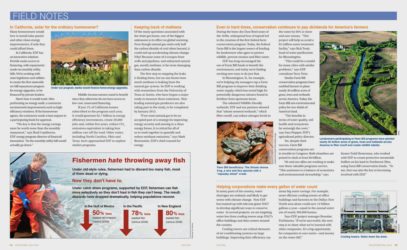
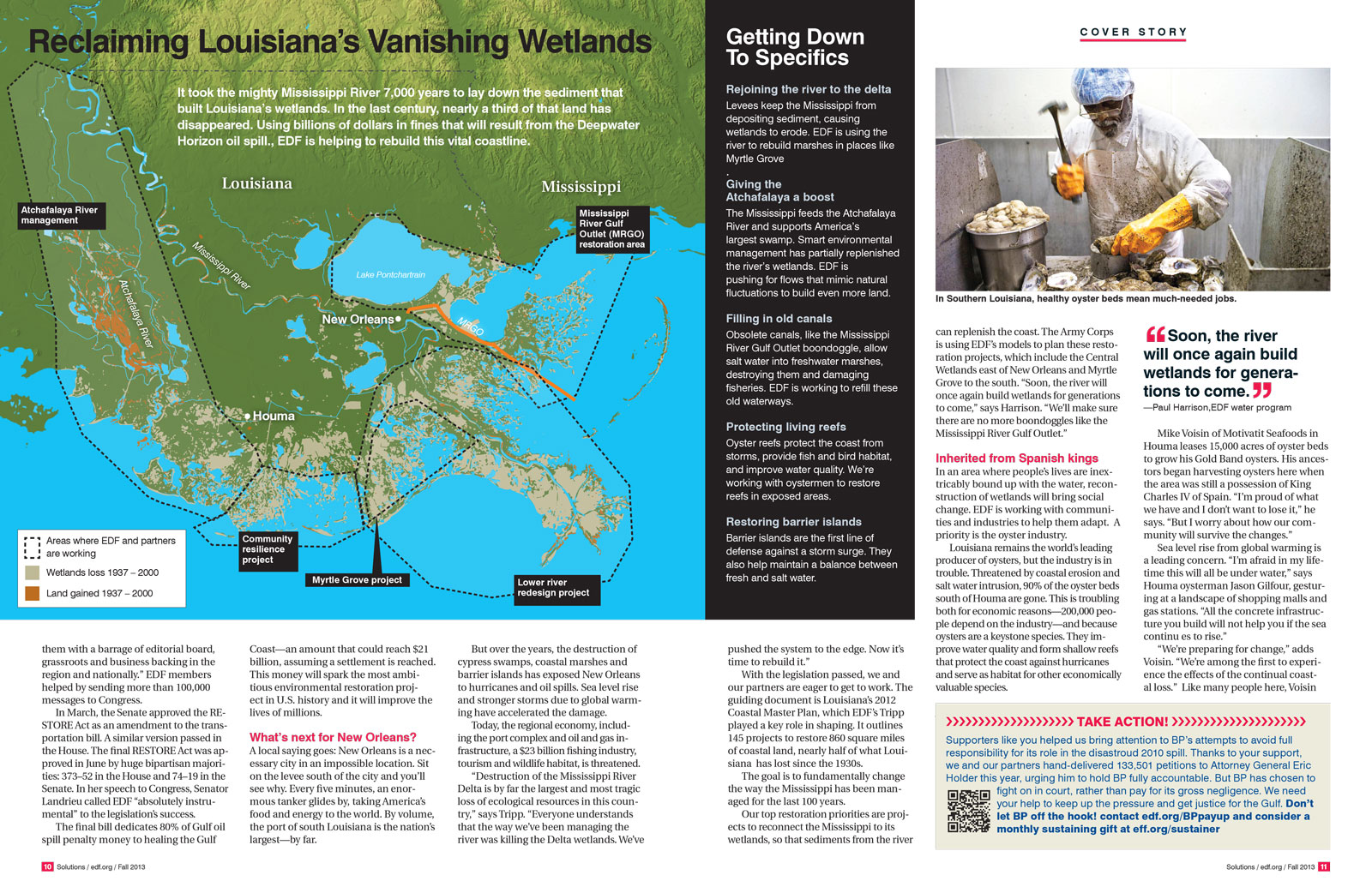
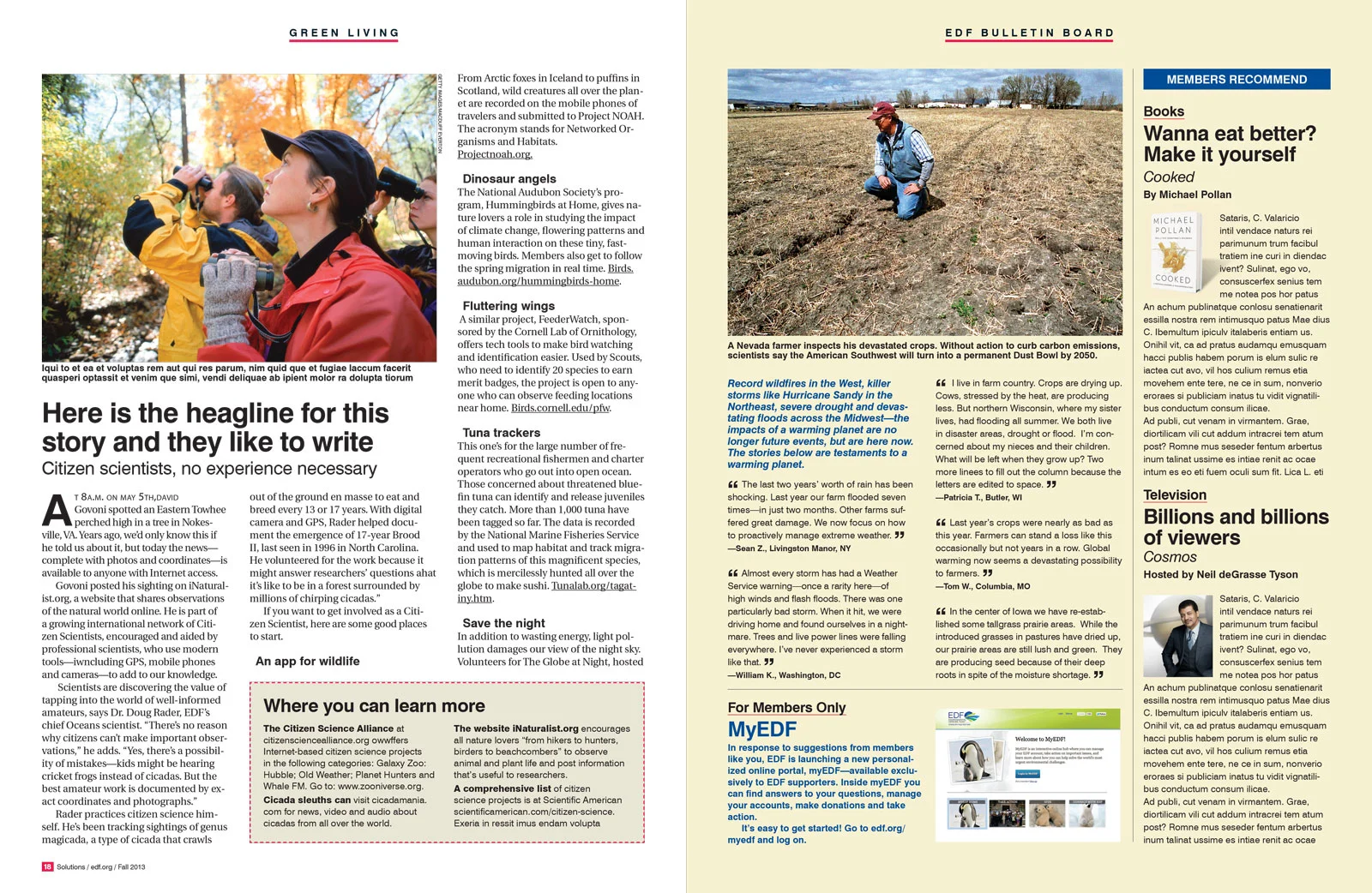
The Environmental Defense Fund produces a quarterly publication to keep its members educated, informed and inspired. The redesign had to use existing fonts and color palettes from EDF's brand assets kit, so the goal was to clean up the format, improve the storytelling and make it more inviting—to make it less like a newsletter and more like a consumer magazine.
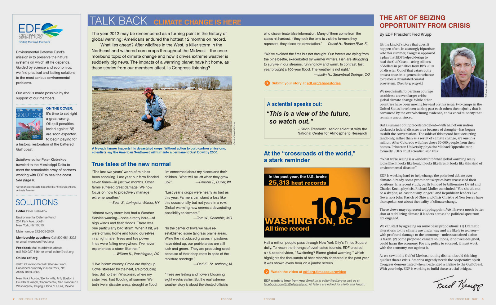
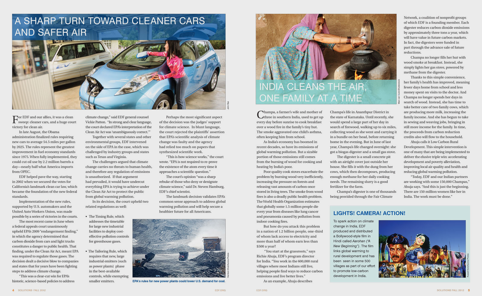
Before


Suggested new expressions of content to increase reader engagement and reinforce the EDF brand. On the inside, the proposal was to leverage photography more dramatically and effectively, especially to highlight an important story. On the back cover, the proposal was to leave the reader with a strong emotional statement that combined a photo with a quote from a noted scientist or environmentalist.

arrows2.jpg

After